Design Insights — September 24, 2026 — Interior Design Insights
10 Living Room Design MistakesMaking Your Space Look Smaller
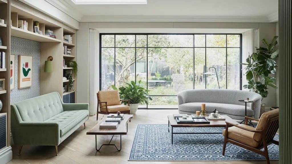
Think your living room is small? It might just be suffering from a case of bad spatial identity theft. Before you start tearing down drywall or hunting for a bigger house, take a closer look at your furniture — because a few sneaky visual optical illusions might be shrinking your space right under your nose.
Even a generously sized living room can end up feeling cramped, dark, or cluttered if a few fundamental design rules are overlooked. When a room feels small, the issue is rarely the actual square footage — it is almost always a matter of visual scale, light, and proportion.
Avoiding these 10 common living room layout and decorating mistakes will instantly open up your space:
1. Pushing All Furniture Directly Against the Walls
It feels counterintuitive, but pushing every sofa, chair, and side table flat against the perimeter does not make a room look bigger — it highlights the room's boundaries and creates an empty, awkward dead space in the center.
The Fix: Float key seating pieces at least a few inches away from the wall. Pulling furniture inward creates breathing room, establishing depth and conversational intimacy.
2. Sizing Your Area Rug Too Small
A tiny rug sitting like a postage stamp under a coffee table fragments the floor plan, making the seating area look pinched and miniature.
The Fix: Choose an area rug large enough for at least the front legs of all major seating pieces to rest comfortably on top. In a small space, a larger rug visually expands the boundary of the living area.
3. Hanging Curtain Rods Right Above the Window Frame
Mounting curtain rods immediately above the window casing cuts the vertical line of your wall in half, making low ceilings feel lower and window openings look smaller.
The Fix: Hang drapery hardware high and wide — ideally 2 to 4 inches below the ceiling or crown molding, extending 8 to 12 inches past the window frame on each side. This draws the eye upward and floods the room with perceived height and width.
4. Relying on Heavy, Visual-Weight Furniture
Overstuffed leather sofas, skirted armchairs, and solid boxy coffee tables block sightlines and absorb light, making the floor area feel congested.
The Fix: Opt for furniture with slender profiles and raised legs. Sofas and chairs that sit on exposed leg structures allow light and air to pass underneath, keeping the floor plane feeling continuous.
5. Blocking Natural Light & Pathways
Placing high-backed sofas, tall bookcases, or bulky accent chairs right in front of window openings or main doorways creates physical and visual barriers.
The Fix: Keep sightlines clear from the entry point of the room toward windows. Use low-profile silhouettes like benches or low-backed chairs near natural light sources.
6. Using a Single Overhead Light Source
A single ceiling light fixture casts harsh shadows into corners and flattens the dimensions of a room, emphasizing tight corners and hard edges.
The Fix: Layer your lighting at different heights. Combine ambient overhead lighting with task lighting (floor lamps, reading lights) and accent lighting (table lamps, sconces) to illuminate corners and add multi-dimensional depth.
7. Overdecorating with Micro-Clutter
Filling every tabletop, shelf, and wall surface with small decor items breaks up visual continuity. A dozen small knick-knacks feel significantly more chaotic and cramped than two or three larger, intentional statements.
The Fix: Embrace scale over quantity. Trade a gallery of tiny picture frames for one bold piece of oversized artwork, and curate tabletops using the “rule of three” with varying heights.
8. Choosing Dark, Heavy Window Treatments
Thick, dark drapes absorb light and shrink the perimeter of a room, creating a closed-in, cavernous effect — especially in spaces with limited natural sunlight.
The Fix: Choose lightweight, breathable fabrics like linen or sheer cotton in light neutral shades that allow soft, diffused daylight to penetrate even when drawn.
9. Painting Walls in Flat, Ultra-Matte Dark Colors Without Strategic Lighting
While deep colors can create dramatic “jewel-box” spaces, dark matte paint in a room without adequate natural light absorbs all light, making walls feel like they are closing in.
The Fix: If you love deep hues, balance them with reflective surfaces, mirrors, and warm lighting layers — or opt for soft, light-reflective neutral paint with warm undertones to bounce daylight across the room.
10. Ignoring Vertical Wall Space
When floor space is limited, focusing solely on lower-level furnishings leaves the upper half of the room cold and unused, drawing all attention down to the tight footprint.
The Fix: Utilize vertical real estate with floor-to-ceiling shelving, tall artwork, or full-height vertical paneling. Drawing the eye toward the ceiling maximizes the room's total volume rather than just its floor plan.
By rethinking layout assumptions, honoring visual scale, and letting light do the heavy lifting, even the most compact living room can feel airy, expansive, and effortlessly grand. Great interior design isn’t about working with more square footage — it’s about maximizing the potential of the footprint you already have. Apply these elevated tweaks, clear out the visual clutter, and watch your space open up to its full, light-filled potential.
Next article
5 Fall 2026 Color Trends ThatWill Instantly Transform Your Space