Decoding the Baubles: The Hottest Christmas Color Palettes for 2025
Hello, design aficionados, and welcome back to the atelier of holiday aesthetics! As the leaves trade their summer chroma for autumnal earth tones, it’s time to pivot our focus to the ultimate design challenge: decking the halls without resorting to last year’s tired scheme. For 2025, the mood is a fascinating juxtaposition of opulent richness and serene minimalism. Put away the aggressively shiny tinsel, my friends—we’re curating, not just cluttering!
The Modus Operandi for ’25: Texture Over Tinsel
Before we dive into the color swatches, note the overriding textural trend. Regardless of your chosen palette, this year is about haptic appeal. Think velvet ribbons that beg to be touched, matte metallic finishes that absorb light rather than bouncing it aggressively, and rich, organic materials. The goal is a lived-in luxury—a space that feels both grand and grounded.
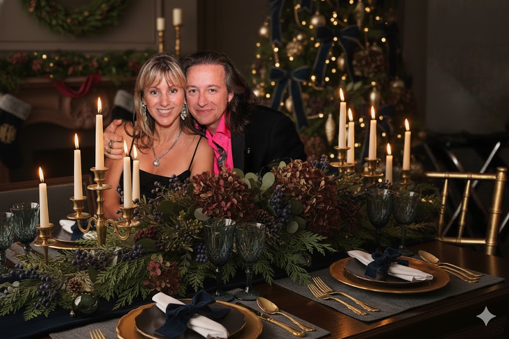
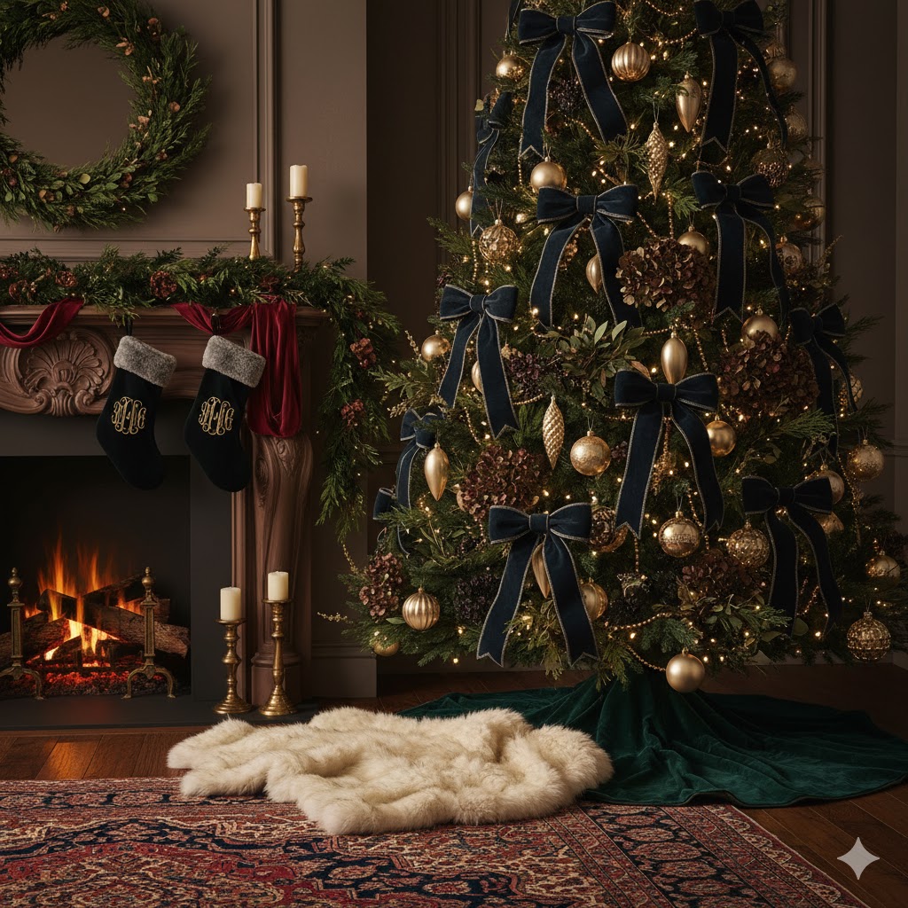
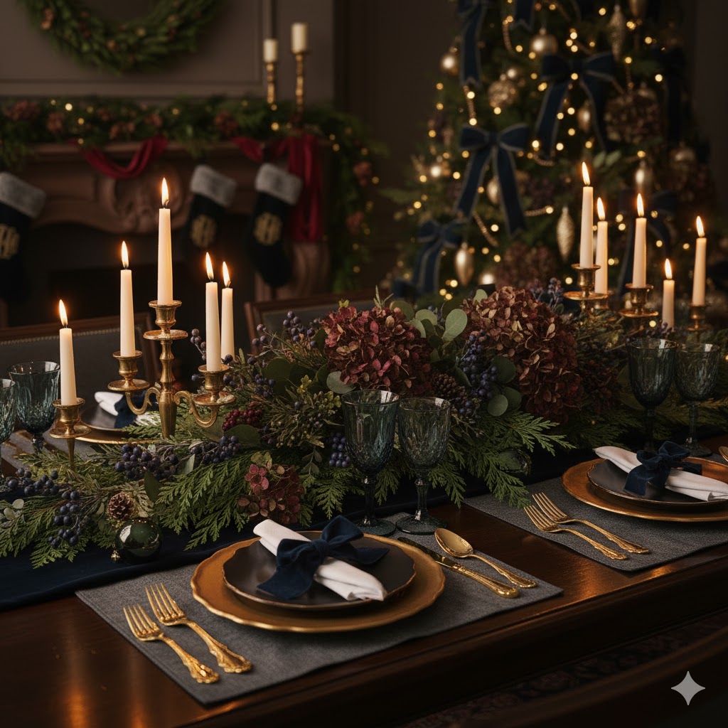
👑 Palette 1: Moody Elegance & The Jewel Box Effect
If your design language leans toward the dramatic and sophisticated, this is your moment. The en vogue palette for 2025 is deep, saturated, and inherently luxurious.
- The Anchor Hues: Forget bright primary colors. We’re talking Emerald Green (think deep forest canopy), Burgundy/Wine, and an unexpectedly chic Midnight Navy or even Aubergine (that’s eggplant to the uninitiated, but we prefer the elevated term).
- The Counterbalance: To prevent this from feeling like a vampire’s lair, these deep tones are being juxtaposed with the softest Champagne Gold or warm Brass. The metallic finish should be brushed or antiqued—we want a glow, not a glare.
- Design Tip: A monochromatic navy or black tree, adorned exclusively with gold accents and rich velvet bows, creates a stunning focal point that screams bespoke tailoring. It’s moody, refined, and perfect for an evening ambiance.
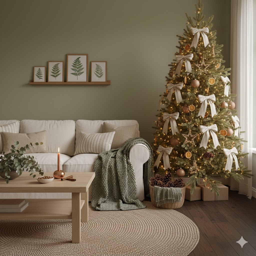
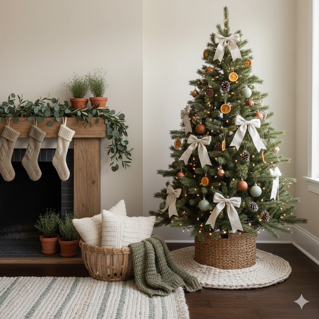
🌿 Palette 2: Organic Serenity & The New Neutral
For those who prefer their interiors to breathe, 2025 champions a continuation of the nature-inspired ethos, but with a more intentional, curated feel.
- The Star Player: Sage Green and its earthier cousin, Olive Green, are the undisputed protagonists. They act as a calming neutral against which other textures can play.
- The Supporting Cast: Pair these greens with Cream, Ivory, and warm Wood Tones (think Gingerbread Brown or Terracotta accents).
- The Metallic Accent: Copper and Matte Bronze are the metallics of choice here. They offer a warmth that prevents the scheme from veering into cold coastal territory, instead lending itself to a cozy, chalet-inspired aesthetic.
- Design Tip: Focus on materiality: layer linen stockings, incorporate pinecones and dried citrus slices (hello, décor dramatique), and ensure your lighting is strictly warm white for maximum hygge.
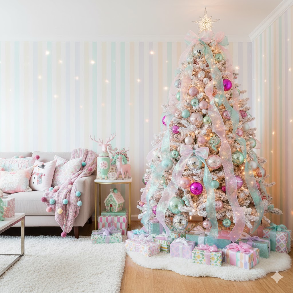
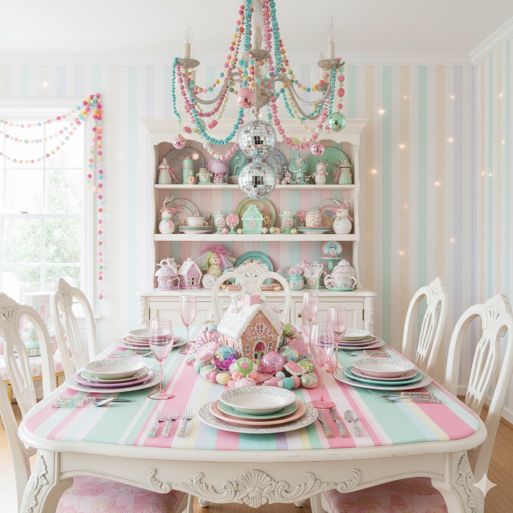
🍬 Palette 3: Playful Pastels & Maximalist Whimsy (Kitschmas)
In a delightful rebellion against too much restraint, the Kitschmas movement is leaning hard into playful, vibrant hues, often referred to as Peppermint Pastels. This is maximalism with a sense of irony and joie de vivre.
- The Key Shades: Think Blush Pink, Mint Green, and Icy Blue, often mixed with stark White or even pops of vibrant Fuchsia.
- The Finish: Here, we welcome back a bit of shine—but keep it interesting. Iridescent finishes and materials resembling gumdrops and marshmallows are prime.
- Design Tip: This palette thrives on layering and a lack of self-consciousness. Mix patterns fearlessly, embrace oversized ornaments, and perhaps introduce a touch of the aforementioned disco ball motif for a truly camp statement. It’s about creating visual rhythm through joyful chaos.