An Interior DESIGNER’S Authority On Color In Hospitality, workplace and healthcare enviornmnets
Welcome, fellow design enthusiasts! Today, let’s delve into the fascinating world of color theory and its profound impact on the ambiance and functionality of interior spaces. As seasoned interior designers, we understand that color isn’t merely decorative; it’s a powerful tool that can influence emotions, behavior, and even productivity. Join us as we explore how strategic color application can enhance hospitality, workplace, and healthcare environments, creating spaces that resonate with positivity and functionality.
Hospitality Spaces: Inviting Experiences through Color
When it comes to hospitality design, the right color palette can transform a mere room into a memorable experience. Think about the warm hues of a cozy café or the serene blues of a tranquil spa. These colors aren’t chosen at random; they’re carefully selected to evoke specific emotions and enhance the overall ambiance. Warm tones like soft oranges and earthy browns can create a sense of intimacy and comfort, perfect for inviting guests to unwind and socialize. Meanwhile, cool tones such as calming blues and refreshing greens can instill a feeling of relaxation and rejuvenation, ideal for spa retreats or boutique hotels.
Bright tones of orange are often used in gyms for active wear brands due to its motivational, get-up-and-go qualities. This vibrant hue can also been seen as a negative color in the US and often related to prison inmate uniforms and is heavily linked to Halloween.
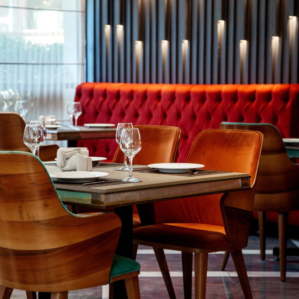
Prepare yourself, for the mere sight of a red tablecloth could send your hunger soaring to new heights, while simultaneously boosting your restaurant’s bottom line. When it comes to colors in restaurants red, often hailed as the champion of appetite stimulation, wields its power with undeniable force. Its vibrant hue grabs our attention, igniting our senses and priming our palates for indulgence. Countless studies affirm its ability to coax us into consuming more and devouring with gusto, especially when coupled with the sunny optimism of yellow. Little wonder then, that red reigns supreme in the foodservice realm, dominating the landscape of fast-food chains and casual dining alike.
Yet, red doesn’t stand alone in its quest to tantalize our taste buds. Enter orange, a close contender in the hunger-provoking Olympics. With its associations to sunsets, pumpkins, and the zest of citrus fruits, orange seamlessly joins the ranks of nature’s appetite enablers, amplifying the allure of your culinary offerings.
In the realm of appetite stimulation, yellow joins the ranks of red and orange as a formidable force. Exposure to these three vibrant hues not only amplifies food consumption but also hastens the pace of eating. Positioned as a mid-range appetite booster, green emerges as a symbol of life-sustaining organic materials in the collective consciousness. Restaurants say their patrons perceive green as a reassuring presence, evoking images of lush vegetation and nourishing edible plants. Humans instinctively gravitate towards verdant landscapes, associating them with fertile soil and abundant sustenance.
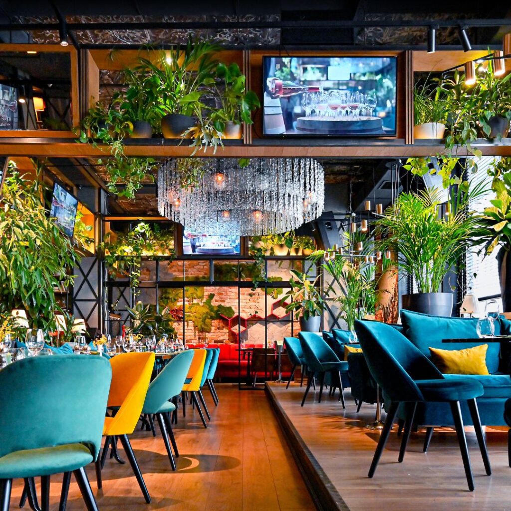
When implementing the color green into a restaurant, by instinct, individuals seeking healthier choices naturally gravitate towards green. The allure of light or vibrant shades of green doubly rewards us, as they not only exude a calming aura but also foster mental well-being and serenity.
By understanding the psychology of color, designers can craft hospitality spaces that leave a lasting impression on guests, ensuring they feel welcomed and cared for from the moment they step inside.
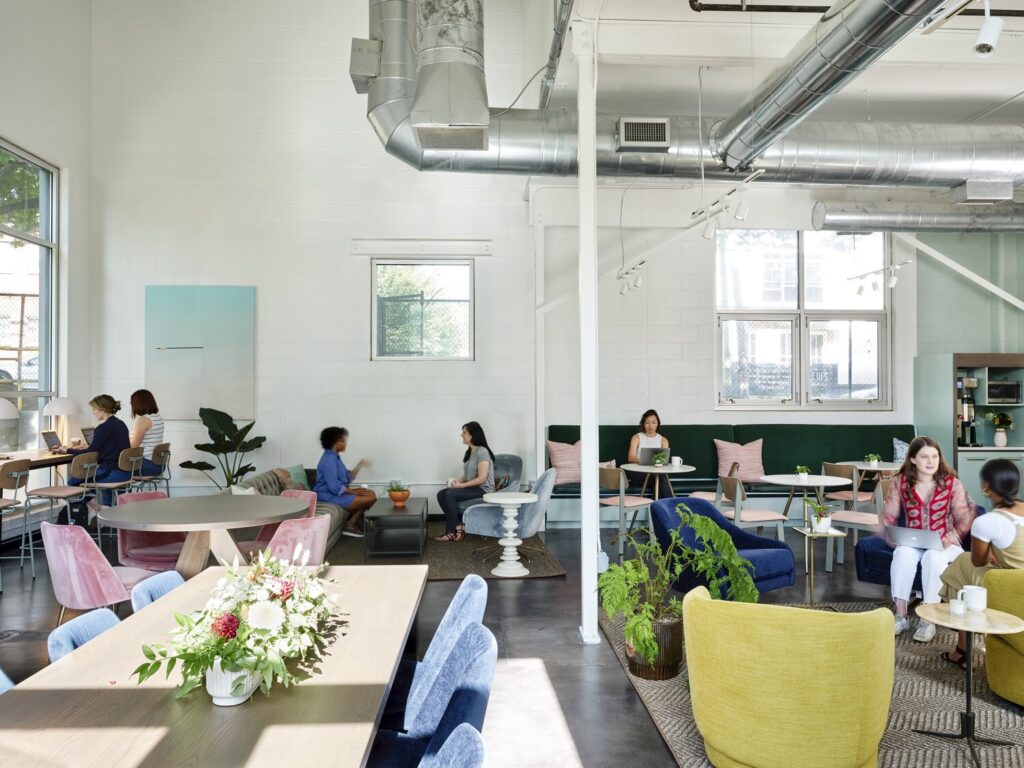
Workplace Environments: Boosting Productivity with Color
In the fast-paced world of business, productivity is key, and the right workplace design can make all the difference. Color plays a crucial role in this equation, influencing everything from focus and creativity to collaboration and motivation. For example, vibrant shades like energizing yellows and stimulating reds can promote creativity and innovation, making them perfect for design studios or brainstorming areas.
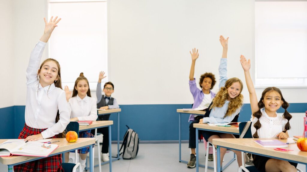
Did you know the color blue has been proven that students exposed to this color before undertaking an exam were more successful and achieved greater results. On the flipside too much blue can become cold and make people feel unwelcome. Be sure to balance this with warm undertones.
Did you know too much green can cause people to become placid, lazy, slow moody, depressed and lethargic? This is certainly something to think about when having your workplace painted. Surprising as it may seem, an overly green workspace has the potential to slow down productivity and dampen spirits, leaving employees feeling lethargic and dispirited. While green undoubtedly has its merits in promoting relaxation and mental well-being, moderation is key to avoiding its potential drawbacks. Striking a balance between incorporating green for its calming effects and ensuring a dynamic environment that fosters motivation and productivity is essential for creating a harmonious and uplifting workspace.
On the other hand, calming tones like soft greens and muted blues can foster concentration and focus, ideal for quiet workspaces or conference rooms. By strategically incorporating these colors into the office environment, designers can create a dynamic and inspiring workplace that empowers employees to perform at their best.
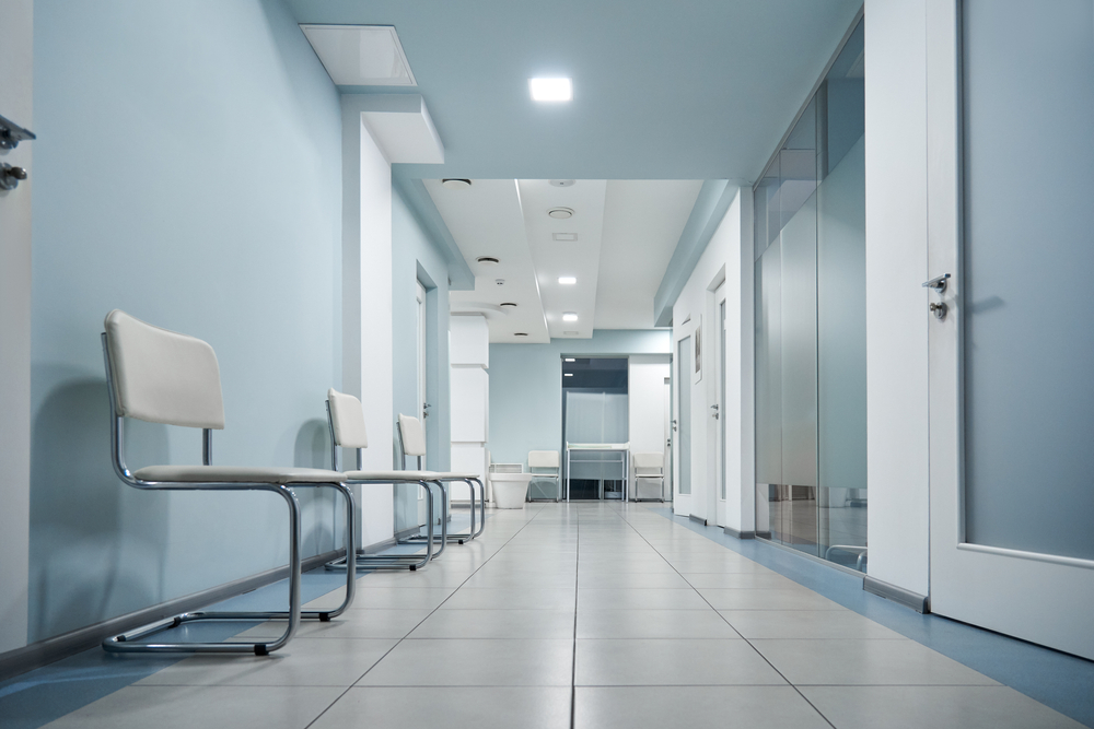
Healthcare Facilities: Healing Environments with Color Therapy
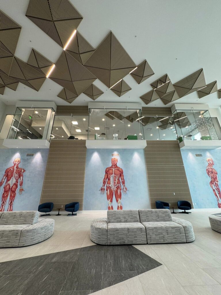
In healthcare design, the importance of color extends beyond aesthetics; it can actually contribute to the healing process itself. Research has shown that certain colors have the power to reduce stress, alleviate pain, and promote a sense of well-being among patients. For instance, soothing shades of blue can create a calming atmosphere in hospital rooms, helping patients feel more relaxed and at ease during their stay.
Similarly, cheerful hues like soft pinks and warm yellows can uplift spirits and create a sense of optimism in pediatric wards or rehabilitation centers. Word of caution when incorporating the color yellow, Vibrant shades of yellow should be used with caution when painting the maternity ward in hospitals. Too much of this vibrant color can cause distress. It has been known that babies cry more in yellow rooms than any other color. By harnessing the principles of color therapy, designers can transform healthcare facilities into healing environments that promote both physical and emotional wellness.
Can you guess what color is used to counteract anger and violence? A color that is often associated with tenderness and compassion. A study in the US state prison showed inmates were significantly calmer when exposed to Baker Miler Pink. This fun color has been proven to diffuse tense situations and fosters empathy. Whether incorporated into interior spaces or utilized in therapeutic environments, the gentle allure of pink can serve as a powerful antidote to aggression, helping to promote understanding and peaceful interactions.
The impact of color in interior design cannot be overstated. From hospitality spaces to workplace environments and healthcare facilities, the strategic application of color can enhance the overall experience for occupants and visitors alike. In the symphony of design, the art of color selection orchestrates an experience that transcends mere aesthetics. It shapes emotions, influences choices, and transforms spaces, ensuring that every visit to your restaurant is a harmonious symphony of delight. By understanding the psychological effects of different hues and tones, designers can create spaces that not only look beautiful but also foster positive emotions, productivity, and well-being. So let’s embrace the power of color and unlock the full potential of our interior spaces!