Pantone 2026: We Waited 26 Years for… White?
Grab your swatch books and clutch your pearls, darlings. The Pantone oracle has spoken.
Every year, the design world collectively holds its breath, waiting for the chromatic decree that will supposedly dictate our lives, our throw pillows, and our regrettable fast-fashion choices for the next twelve months. We prepare for bold! We prepare for revolutionary! We prepare for something that rhymes with “Schmexican Schminak”!
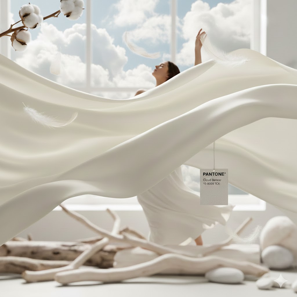
And for 2026, Pantone has gifted us with… Cloud Dancer.
Cue polite golf clap.
Let’s be crystal clear: Cloud Dancer is white.
Okay, okay, read the press release. It’s not just white. It’s a “soft, airy white that symbolizes calm, quiet reflection, and a balance between the digital world and our primal need for peace.”
Translation: We are all collectively losing our minds from doom-scrolling, and Pantone thinks we need a timeout in a padded room.
This is historical, actually. It’s the first time in 26 years Pantone has chosen a white hue. Twenty-six years! The last time white was this trendy, Y2K was an actual threat and I was still trying to make low-rise jeans happen.
The Vibe Check
Don’t get me wrong. I love white. White pays my mortgage. White is the reason clients hire me—to tell them which of the 4,000 nearly identical shades of white won’t make their living room look like a dentist’s waiting area.
But announcing white as the “Color of the Year” feels a bit like announcing that “Water” is the “Beverage of the Year.” It’s essential, yes. But is it exciting?
It’s funny looking at the competition. While Pantone is meditating in an empty yurt, everyone else is ordering whiskey at a dark bar. Glidden went with “Warm Mahogany” (a moody reddish-brown), and Minwax chose “Special Walnut.” The other paint brands are clearly embracing a cozy, dark academia aesthetic. They want libraries and leather chairs.
Pantone, meanwhile, wants us to floating in an ethereal sensory-deprivation tank.
Will I Use “Cloud Dancer”?
This is the million-dollar question (or at least the several-thousand-dollar retainer question).
Of course I’m going to use it. I use its cousins—White Dove, Chantilly Lace, Swiss Coffee—every single day.
Here’s the smart take on this: Cloud Dancer isn’t really a “color trend” in the way Emerald Green or Millennial Pink were. You don’t paint an accent wall Cloud Dancer to make a statement.
Cloud Dancer is a palate cleanser. It’s a foundational element. It’s the blank canvas that allows the art, the textures, and the actual colors in a room to breathe.
How I Might Use It (The “Yes” File):
- The Ultimate Minimalist Kitchen: We’re moving away from stark, sterile whites. If Cloud Dancer truly has that soft, airy quality, it’s perfect for cabinetry where you want warmth without leaning yellow.
- Ceilings and Trim: The unsung heroes. A soft white on the ceiling reflects light beautifully without feeling oppressive.
- Texture Wrapping: Imagine a room bathed entirely in this shade, but relying heavily on texture—bouclé sofas, chunky wool rugs, plaster walls, linen drapery—all in that same “Cloud Dancer” monochrome. That is chic. That is expensive tranquility.
How I Will definitely NOT Use It (The “Hard Pass” File):
- Telling a client, “I picked this color to balance your primal need for peace.” I charge hourly, but even I don’t have time for that level of therapy disguised as design.
- Pretending it’s groundbreaking. I will not present it to a client as groundbreaking and design their whole home in this color.
The Verdict
Cloud Dancer is safe. It’s lovely. It’s the design equivalent of a deep exhale. It’s Pantone admitting that the world is currently a Dumpster fire and perhaps we shouldn’t paint our walls bright magenta right now.
So yes, I’ll use it. I’ll probably embrace the calm. But I’m still buying a moody walnut credenza, just to keep things interesting.