
2015’S COLOR OF THE YEAR & HOW TO USE IT!
The time has finally arrived, the moment I have been anxiously waiting for. The announcement of Pantone’s color of the year has been released to the world. Pantone, the global color authority announced Marsala 18-1438, the color of 2015. Much like the wine it’s full-bodied, earthy and sophisticated. It’s in the red hue family with dark orange and brown undertones. I think it’s a nice departure from the jeweled colors that have embraced our furnishings over the past few years. It can read conviction when incorporated effortlessly into your home. I see Marsala naturally lifting and enhancing a home’s décor. It encompasses a charm of versatility.”Marsala enriches out mind, body and soul, exuding confidence & stability” Leatrice Eiseman, executive director of the Pantone Color Institute said in a statement. I believe this universal color will translate beautifully not only to home furnishings, but to fashion as well. Most homeowners should feel comfortable embracing this color, especially in small dosages. Here are a few ways to ease this unifying color into your home, without providing any distractions to your current décor.
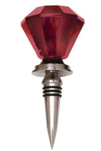
1: Wine Stopper
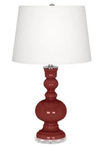
2: Color Plus Apothecary Lamp
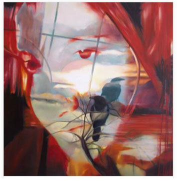
3: Artwork
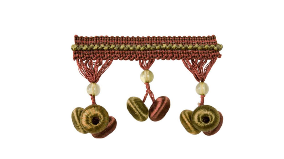
4: Gum Drop Tassell Trim
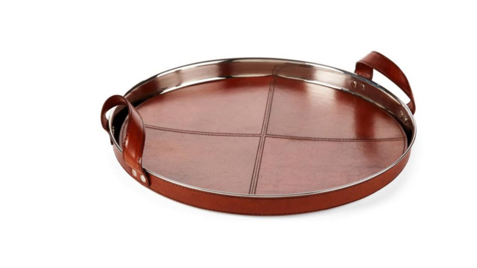
5: Leather Chapin Tray
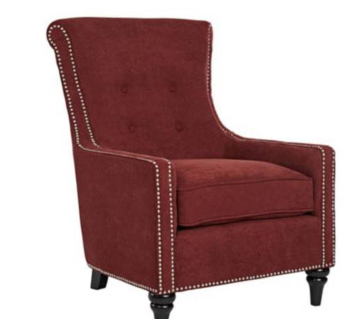
6: Occasional Chair
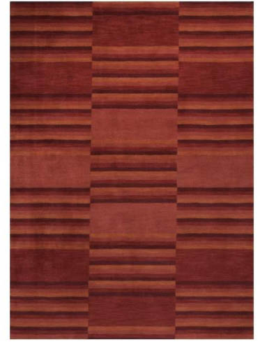
7: Area Rug
Leave a Reply
You must be logged in to post a comment.