
How Can You Coordinate Colors in a Room?
Individual colors might have their own separate appeal, but together, they can completely fail to coordinate. To grasp the relationship between reds and blues, whites and blacks, greens and browns and more, you have to understand and appreciate the “character” of each color. What do we mean by character?Every color has a unique personality, which changes not only the appearance of a room but also its mood. You need to find colors that cooperate and agree with one another, serving to complement or contrast each other in attractive or exciting ways. In doing so, you’ll create the perfect scheme for your space.Planning that scheme is among the most enjoyable parts of the interior design process. In this article, we’ll walk you through some suggestions for color coordination that are easy to follow and relevant to both beginners and experienced decorators alike. Before you begin your renovations, review the advice below.
1. Leverage the Color Wheel
The color wheel should remain one of your primary tools throughout the design process. It indicates the color families and shows how they relate to each other, simplifying your task of finding the right paints for your project. If you need to validate ideas and schemes, the color wheel is the first place you should turn.
2. Contrast With Complementary Colors
Complementary colors are on opposite sides of the color wheel, and each tone emphasizes the richness of the other. When you’re pairing these tones, your best option is to match a subtle color with a more dominant color, such as a lighter orange with a stronger blue. This combination is liable to change with your design, of course.
3. Add Nuance With Related Colors
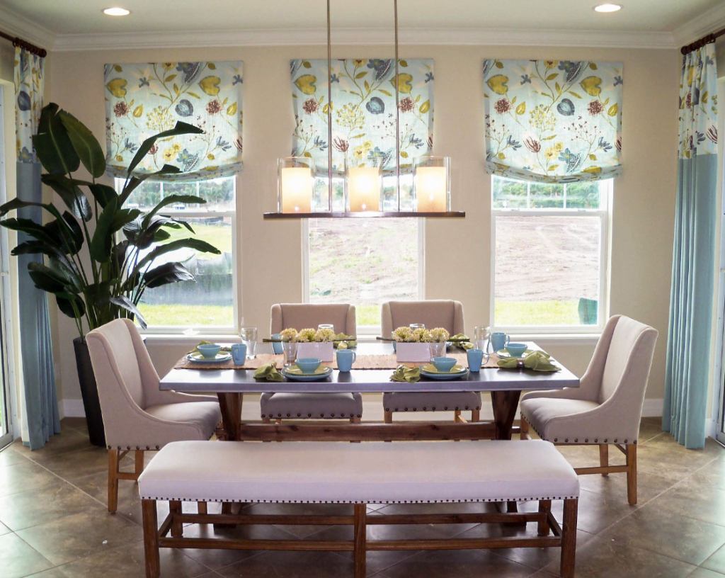
Related colors are adjacent to each other on the color wheel, and they give a nuanced alternative to those who are hesitant to embrace the contrast of complementary colors. The combination of similar tones isn’t necessarily striking or memorable, but it brings cohesion and harmony to a space.
4. Determine Your Accent Colors
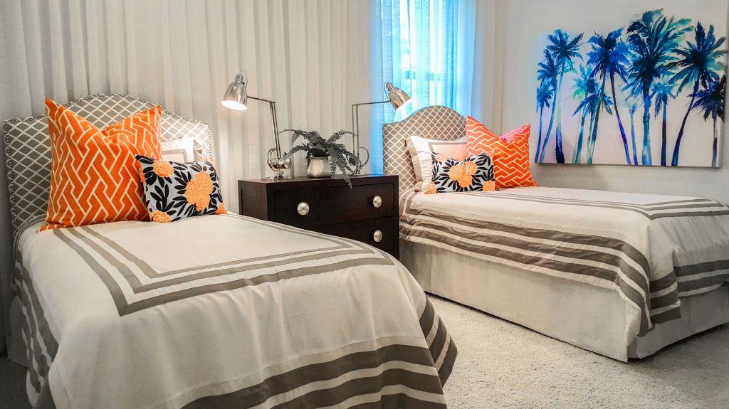
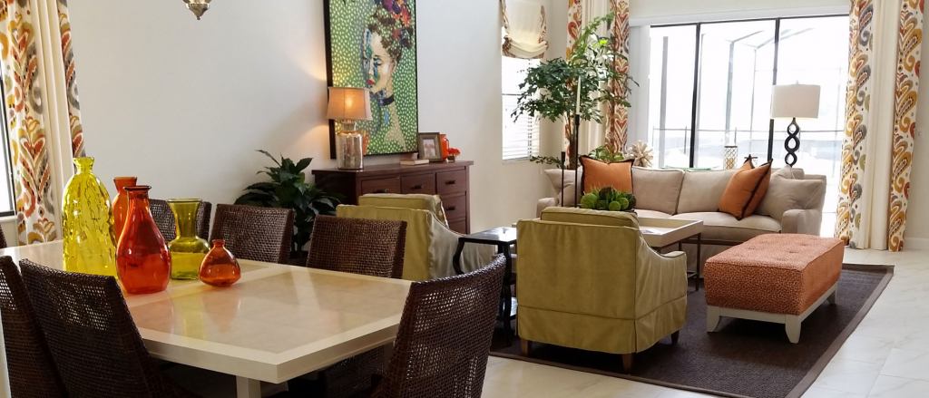
An accent color can pull your room together. You can choose a specific wall as a focal point and add white or black to bring out patterns or paint with two bold colors to tie in with the rest of your decor. If you employ your accents well, they’ll contribute to the unity of your space.
5. Decide Color Placement
The arrangement of your colors is integral to your design, and you should determine your placement based on the value scale. Walls and floors are often a lighter value, with floors slightly darker than walls, and window coverings and furniture are usually a medium value. Your darkest values are your accent colors.
6. Apply the 60-30-10 Rule
The 60-30-10 rule will ensure that the colors in your space are proportional and balanced. The main color for your room should take up 60 percent of the design, the secondary color should take up 30 percent and the accent color 10 percent. This guideline includes more than your paint choices, covering furnishings .
7. Avoid Overcomplicating Your Design
Selecting too many colors or patterns can make your walls loud and distracting, drawing from the value of the rest of the room. As a general rule, four core colors and two patterns are the maximum. As for accents, you should use as many as you need to realize your vision, but again, don’t overcomplicate things.
8. Consider the Flooring in Your Space
The flooring in your space is crucial to consider when you’re deciding on a color scheme. If it’s properly leveraged, it’ll highlight the attractive qualities of your design. When you’re developing strategies to coordinate your walls and flooring, ensure that the colors lend themselves to a sense of continuity, not contrast.
9. Acknowledge the Effect of Your Colors
To restate an earlier point, each color has its own unique character, and these distinct personalities are critical to acknowledge during the design process. Red is energetic, powerful and passionate, while blue is peaceful and dignified. Violet has an air of serenity, while green conveys renewal and growth.
10. Keep Adjacent Rooms in Mind
As you develop your design for the room you intend to change, you should factor in the adjacent rooms as well. Depending on how much of each room is visible from the next, it’s essential to plan your scheme so that it won’t conflict with the flow of your home. Remember, each room exists within a much larger space.
Color Coordination Is Simple
Color coordination is simple as long as you follow time-tested techniques and general rules for managing different elements of your space. With that in mind, have a great time decorating! Holly Welles believes in making the most of any space, no matter how cramped. You can subscribe to her own real estate and home décor blog, The Estate Update, for the latest tips in figuring out homeownership. Guest Blogger- Holly WellesReal Estate Writer, The Estate UpdateW https://www.theestateupdate.com
Leave a Reply
You must be logged in to post a comment.