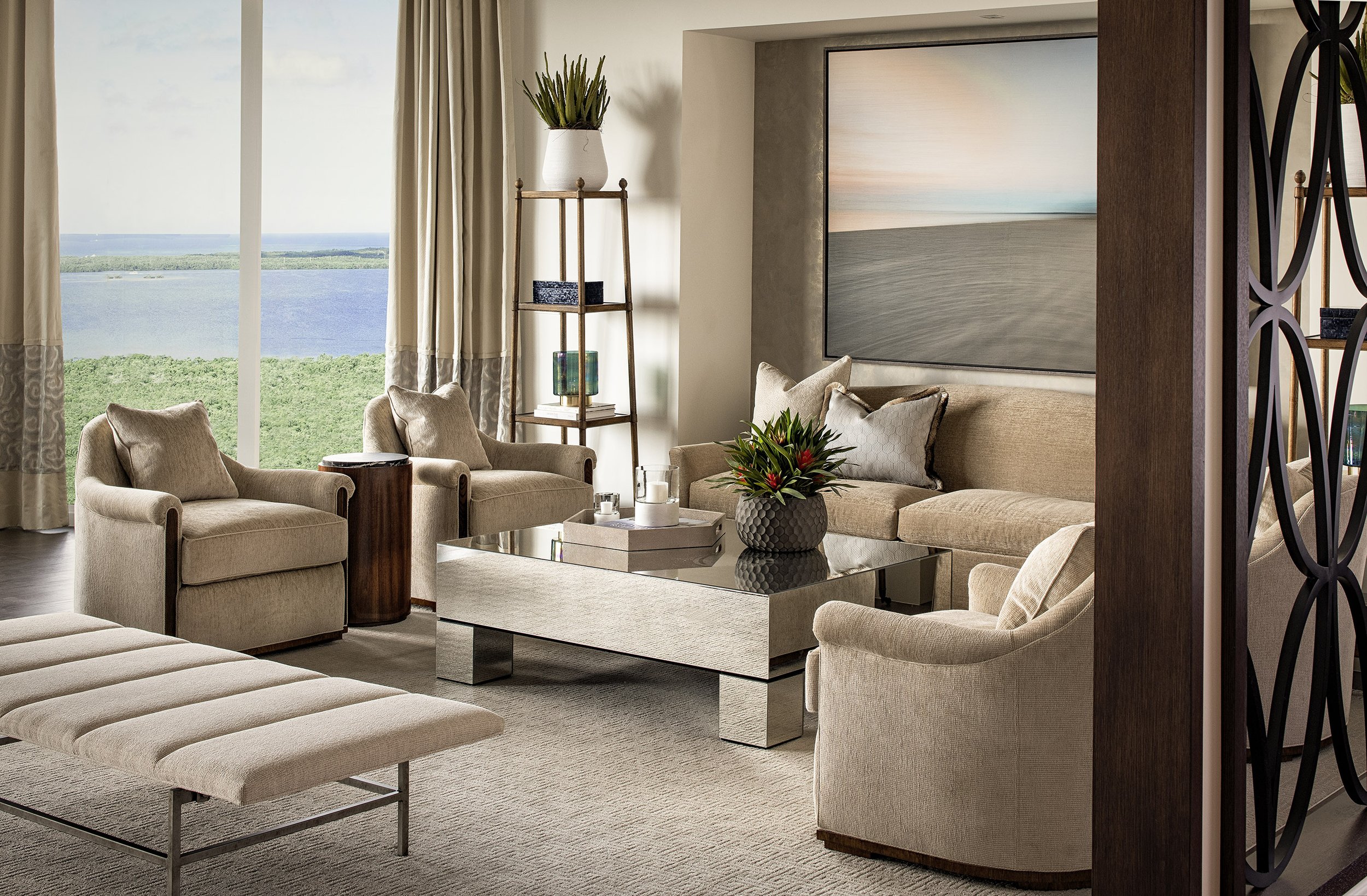
Spice Up Taupe Rooms With These Color Combinations
Taupe, beige, nude — or whatever other variation you go by — is a classic, natural tone that works wonderfully in many interior design settings. From bedrooms to outdoor spaces, taupe colors have the power to create a serene, relaxed, and effortless environment that’s sure to come off chic to any resident or visitor.
But how do you dress up your neutrals to jazz up your home design? Whether you’re finishing up your taupe space or you’re reimagining the one you already have, you are likely well aware by now that taupe can’t simply stand alone.
There are so many amazing color combinations you can pair taupe with. Here are just a few of them to inspire you.
Classic White
Pairing beige with white can be extremely uplifting and opening — perfect for small spaces or rooms without a lot of natural light. White by itself is a very clean, sophisticated color, and when paired with beige, it can remain a bit more grounded and cozy.
Emerald Green
Speaking of grounding, mossy greens and emerald greens have an earthy, rich quality that blends well with taupe for a natural yet elevated look that many can enjoy. If you already love earth tones and want to make your space even more of a sanctuary, this one is a no-brainer.
Navy Blue
Getting a little deeper and darker, adding navy blue to a taupe room can make things a little more royal and regal. This is a super-sophisticated combination, with the grounding notes of navy blue perfectly balancing the earthy, lighter taupe tone.
Burnt Orange
If you’re all about the ‘70s vibes, you should look into adding burnt orange into your mix. By combining burnt orange with a beige, you can bring together a perfectly retro look for any room, even if you want to do it a little bit more subtly.
Mustard Yellow
Mustard yellow is another great choice if you want to capture some vintage energy, even without the addition of actual vintage shapes or other design flourishes. Mustard yellow mixed with a tan shade can give an earthy, retro style that’s both youthful and grounded.
Black
Mixing black with beige can actually be an extremely smart choice, and one that people don’t see often. Even though they are both neutrals, they are essentially the most contrasting neutrals out of the entire family, which means they can work extremely well together and create a dynamic sense of movement within the space that’s difficult to capture with other combinations.
Gray
Gray is another neutral color, but it also gives off a very different vibe than beige does. Gray is much cooler and offers a sense of serenity. At the same time, it’s considered a timeless neutral that can create long-lasting appeal when paired smartly with other neutrals.
Combining the cool calmness of gray with the warmth and lightness of taupe can be very unique and unexpected. Just be sure to add some brighter elements in your home furnishings to play with the otherwise fully neutral palette.
Burgundy
If it’s a sense of depth and richness you crave, why not try out a burgundy or maroon to balance out your beige? Burgundy has a depth and unique tone that can balance out the coolness of beige and taupe colors, making for a contrast that’s similar to the all-black look, but with a little bit more comfort and coziness — which adds warmth.
Baby Blue
Going to the other side of the spectrum, adding a pastel or baby blue to your taupe can brighten up the space and make it feel more lively. Not only is it unique, but it can also feel extremely calming and happy. If you’re looking for something that has a bit more color and ventures further from the neutral palette, this might be the best option for you.
Sage Green
In a way, sage green has a lot in common with beige and taupe. Not only do they both have calming, neutral essences, but they also sit around the same depth in their tone. This is a great choice if you want to match the tone of the taupe but still venture into a bit of a contrast.
Taupe Can Match With Nearly Anything
If there’s one takeaway you can count on, it’s that you can pretty much match beige with just about anything that strikes your fancy and works with the space in question. From the depth of navy blue to the lightness of mustard yellow, you should pick your favorite combination and plan accordingly. Do any of these colors stand out to you?
For more design ideas and inspiration go to http://www.beasleyandhenley.com
Author
Evelyn Long is a Baltimore-based writer and the editor-in-chief of Renovated. She publishes home decor advice and product roundups for readers in spaces both big and small.


Leave a Reply
You must be logged in to post a comment.