Spring 2016 Color Report- Pantone Color Of The Year
Harmonious and softly mindful are Pantone’s colors of the year: Rose Quartz & Serenity. Their gorgeous pairing bring a refreshing feel to one’s home and I feel it’s a nice departure from last years rich color, Marsala. They dance to a song of equality and peace. A beautiful story of well being can be told with these calming colors, in this uncertain world. Rose Quartz & Serenity give off a hint of whimsy. A magical being of sorts, created from sweetness and fairy tales. I see these colors working seamlessly not only in home decor, but in fashion and beauty products as well.
SERENITY
I love the color blue! It’s been my favorite color from the moment I could feel the beauty in colors. I love the blue of Key West, hydrangea blooms and my favorite blue jumpsuit with golden zipper details . I think of all that’s good in the world when I think of the color blue. It brings a sense of peace and serenity to a mind that stays in constant motion. Pantone’s light blue is like a cashmere blanket on a Fall’s day. It can bring warmth and serenity to a space with its appearance. Once you acknowledge this pretty shade in a space you can truly appreciate its beauty. 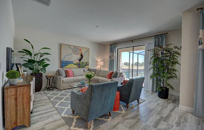
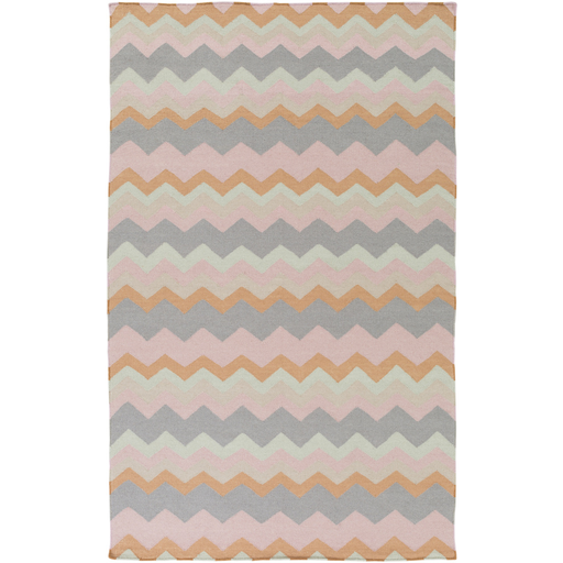
Rose Quartz
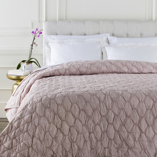
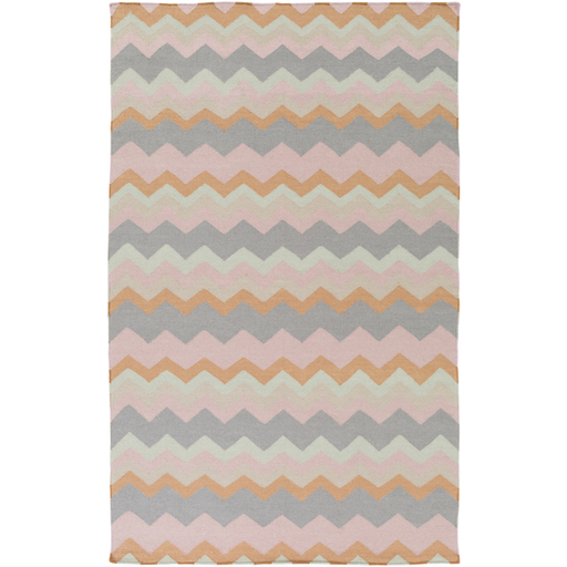
The color pink reminds me of sweet lullabies, cotton candy and pink lip gloss. It’s an antidote to the stresses of life. I can see this compassionate color being used in a nursery a serene painting or a few well played accessories . Airy and light, I can see Rose Quartz in both modern or glamours spaces. Appealing in many finishes this relaxing color can be surprisingly sophisticated and livable. I can see Rose Quartz paired with many colors. I can see it paired with cream, black, gray, teal, burgundy, taup or shade of metallic. 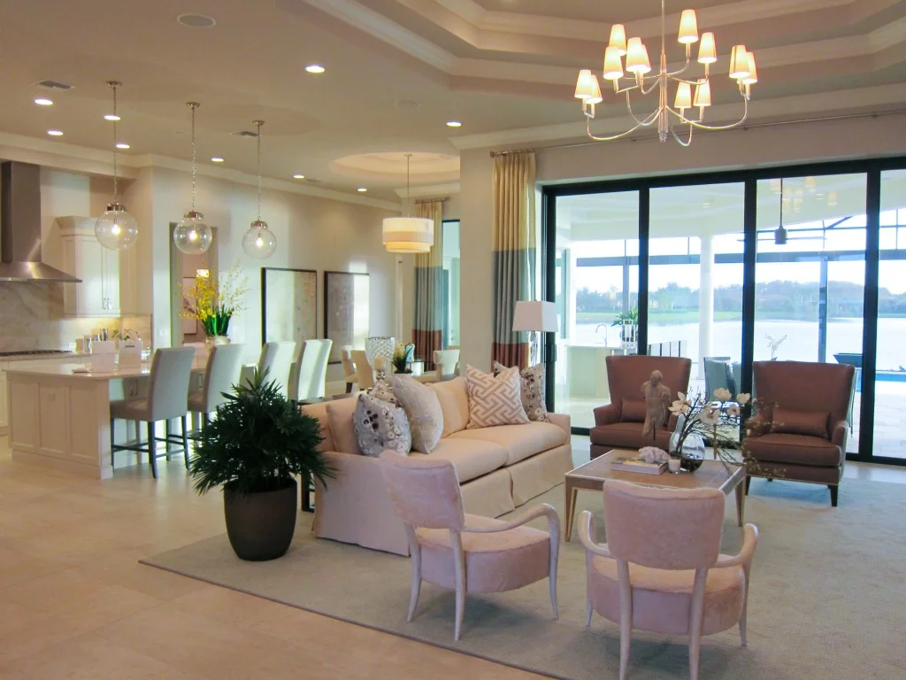
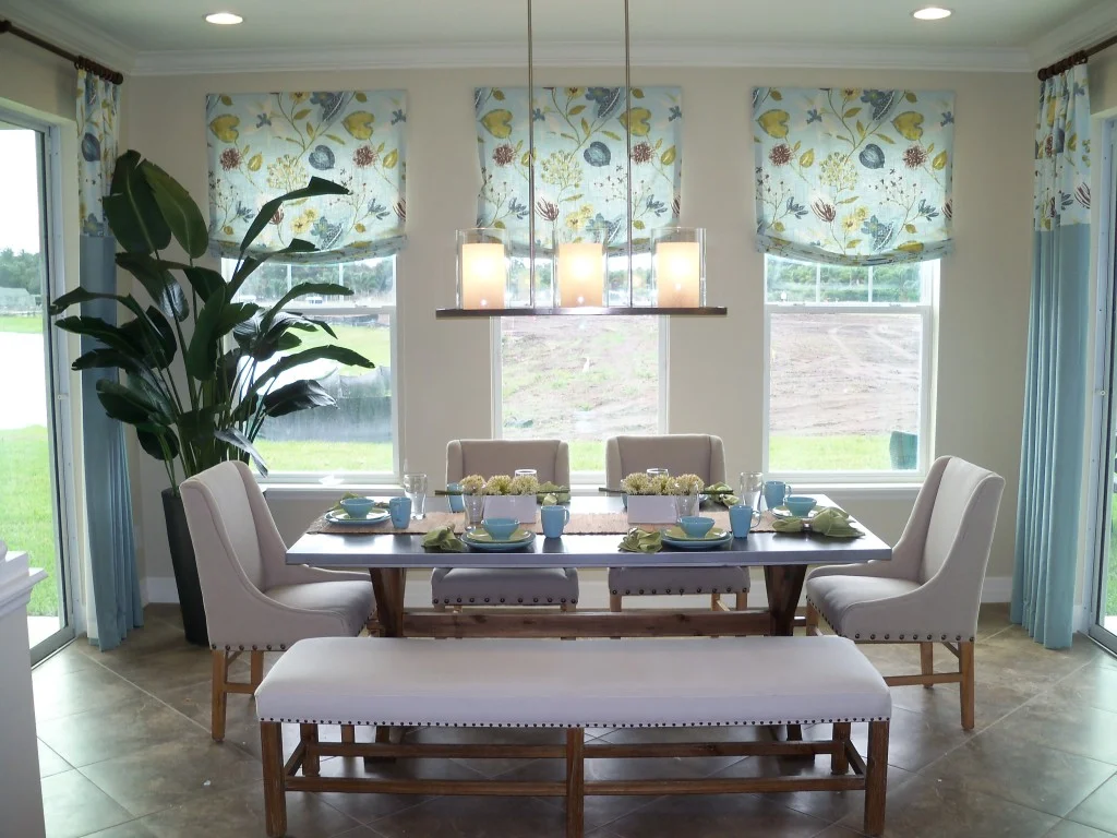
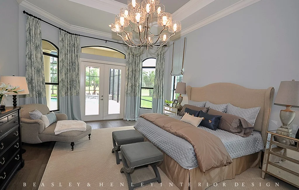
The occasional chairs are adorned in a rose quartz fabric. The designer at Beasley & Henley Interior Design incorporated serenity into the stripe of the drapes.
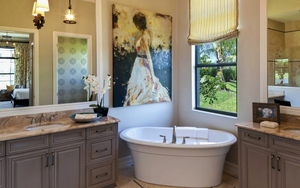
Rose Quartz Wall Paint


Leave a Reply
You must be logged in to post a comment.